A Wellness Brand That Feels Like A Deep Breath
Bare Clinic
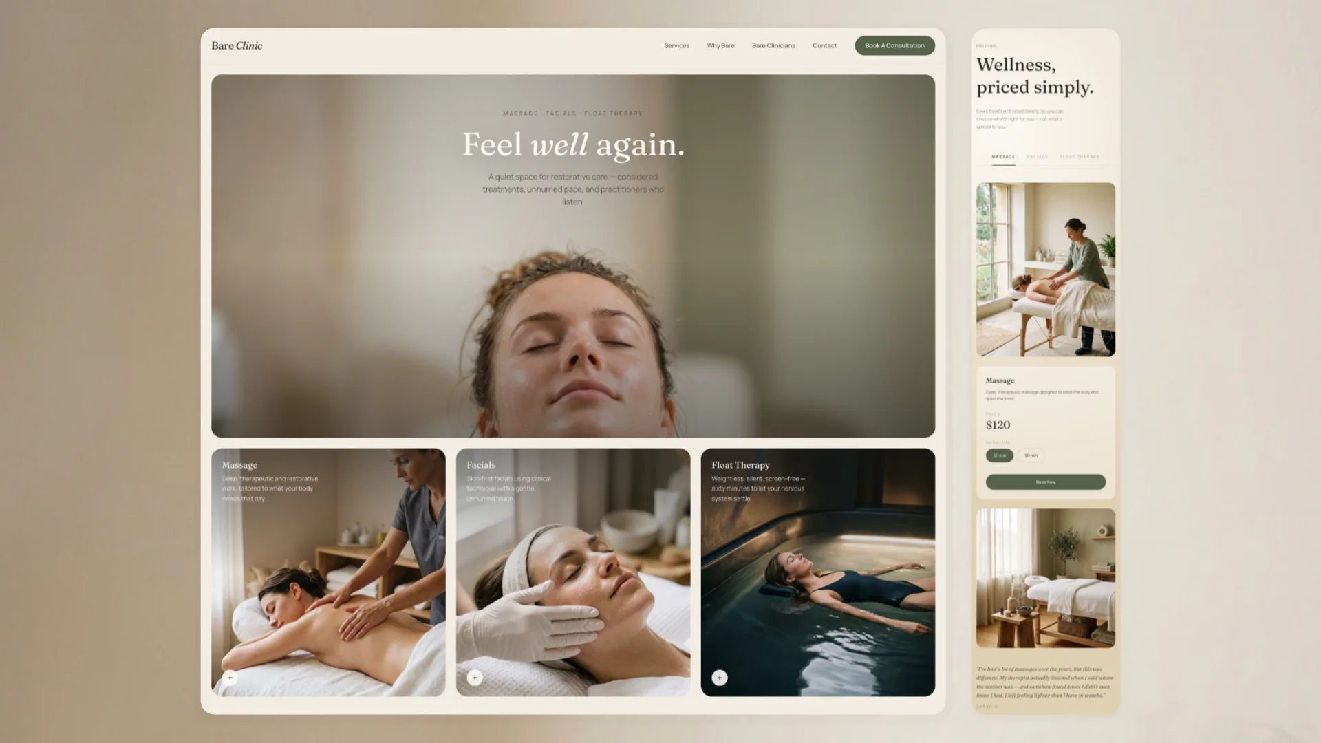
Bare Clinic shows how a wellness website can feel as calming as the treatment itself. Most clinic sites rush visitors with pop-ups, discount banners and generic spa photos. We designed the opposite, an experience that slows people down, builds trust from the first scroll and makes booking feel like the natural next step rather than a hard sell. Warm, natural colours and elegant type give the brand a premium feel, so visitors arrive already believing they're in good hands.
Brand Identity · UX/UI Design · Development
The idea
Wellness brands promise calm, but their websites rarely deliver it. Bare Clinic asks a simple question: what if the website felt like the first five minutes of a treatment?
Our approach
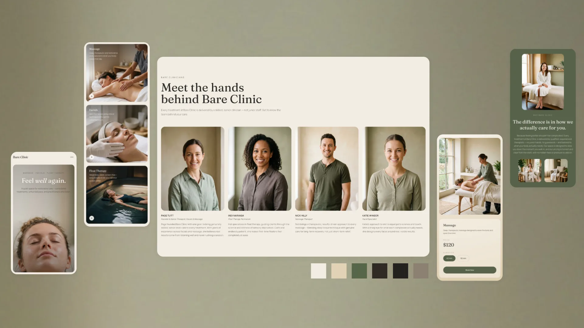
Every section has one clear job, with space to breathe. Visitors find what they need quickly, and the booking button is always close by without being pushy.
The look and feel
Soft sage, warm neutrals and refined, editorial-style headlines create a brand that feels premium and personal, never clinical or cold. It's the kind of site that makes a first-time visitor trust you before they've met you.
The experience
Content reveals gently as you scroll, setting a relaxed, unhurried pace. It's subtle, so it builds atmosphere without distracting from the message.
What we'd do next
We'd test the booking journey with new and returning clients, check how it performs on mobile and measure how many more visitors become bookings.