A Tourism Board Reimagined — Brand-Led, Not Feature-Led
Visit Sunshine Coast
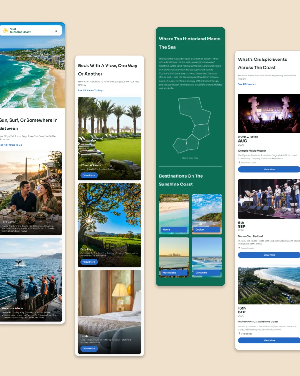
This concept imagines Visit Sunshine Coast as a brand-led experience. Instead of opening with lists of things to do, it opens with a feeling: the slower pace, the hinterland mornings, the moment you first see the ocean. Big, immersive imagery and confident storytelling draw visitors into the region before they start planning, so by the time they're looking at where to stay and what to book, they've already decided they want to be here.
UX/UI + Visual Design
The idea
Most destination websites lead with features: attractions, listings and deals. This concept explores a different direction. It leads with the brand and the emotion of the place, then helps visitors plan.
Our approach
We treated the homepage like the opening of a story. Each section builds a sense of what makes the Sunshine Coast different, moving naturally from inspiration to practical ideas for the trip.
The look and feel
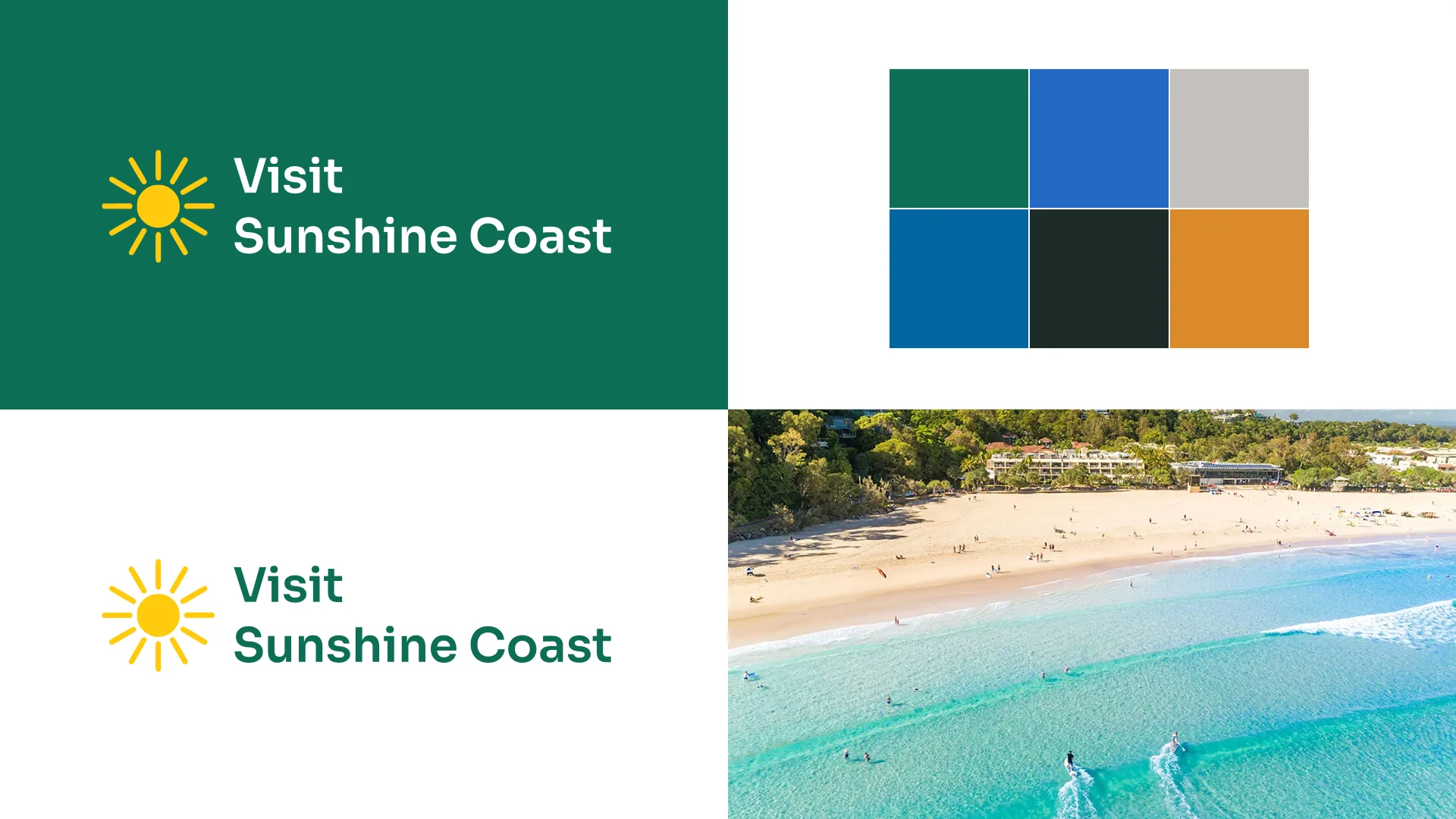
Sun-warmed colours, generous imagery and a relaxed rhythm that matches the region itself. It feels like a holiday, not a directory.
Why it matters for tourism businesses
The same approach works for any operator, whether a resort, a tour company or a restaurant. When your website sells the experience first, visitors arrive excited rather than just comparing prices.
What we'd do next
We'd test how the experience influences time on site, enquiries and bookings, and how it performs for interstate and international visitors.